Journey Bookkeeping // Get Your Head Out of the Books & Back to Your Life.
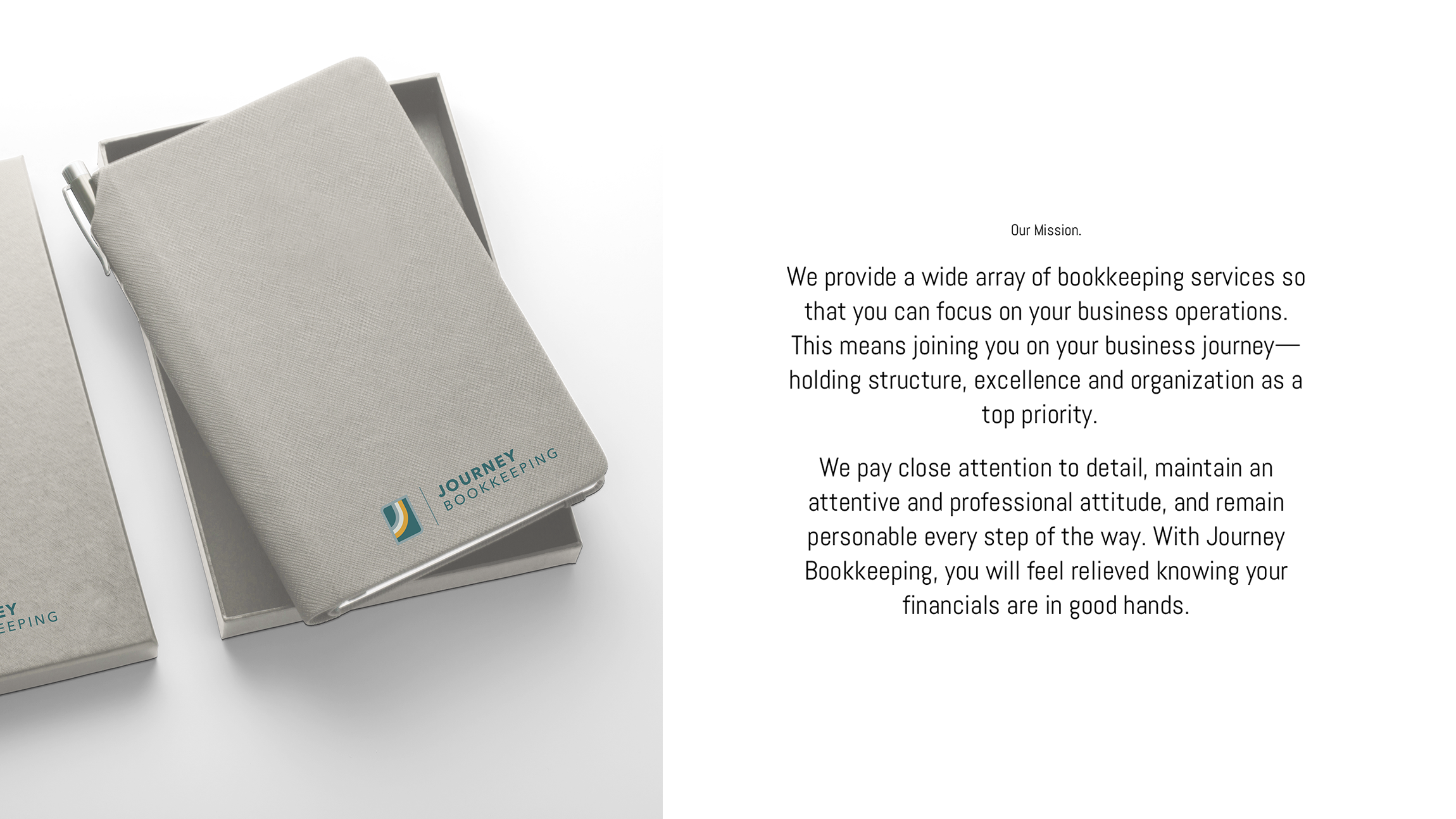
Journey Bookkeeping was in need of a rebrand, content and color palette refresh as well as a new website when they reached out to us to help. We developed a new logo, staying true to the mission of going ‘on the journey with you”. The mark mimics a rainbow, which is often a sign of hope and good fortune at the rainbow's end. The upward motion is representative of growth and prosperity. The abstract photography used throughout the website is also representative of paths and roads. The color palette selected utilizes both warm and cool shades, striking a perfect visual balance.


